

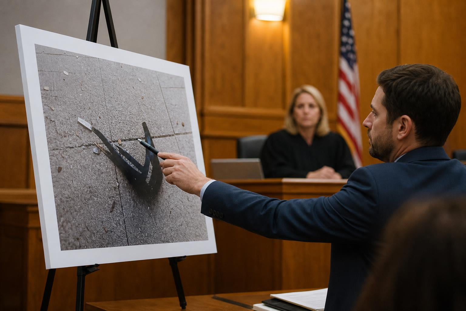
TL;DR
Courtroom lighting is layered, variable, and often dimmed for projected exhibits, which makes foam board signage surprisingly hard to get right. The safest design choices are matte lamination, high-contrast color pairings, large sans-serif type sized for the farthest juror, and one clear message per board. Test every board upright under overhead light from at least 20 feet before trial, because a sign that looks sharp on a laptop screen can become unreadable in a courtroom.
Why Courtroom Lighting Makes Foam Board Design Different
A foam board exhibit that looks crisp on your desk can fail in a courtroom. The reason is straightforward: courtroom lighting is not one fixed condition. It is a shifting mix of overhead fixtures, window daylight, task lights at the bench and counsel table, accent lighting on architectural features, and dimming for video or projected exhibits.
Federal courthouse design guidance says courtroom lighting must support evidence display, video recording, and personal computer equipment, with adjustable lighting and vertical footcandles directed toward the judge, witness, and jury. The U.S. Courts Design Guide sets general courtroom illumination at 40 to 75 footcandles (roughly 430 to 800 lux), with dimming capability for projected exhibits and safety lighting that can drop as low as 1 footcandle.
That range is enormous. A board designed for 800 lux may wash out or throw glare under bright overhead lights, while one designed with subtle color palettes may disappear entirely when the room dims for a PowerPoint. Learning how to design foam board signage for courtroom lighting conditions means accounting for this variability before you send a file to print.
If you’re preparing courtroom exhibit boards, custom foam board printing with the right lamination and sizing choices will save you from last-minute reprints.
Quick Answer: The Safest Courtroom Foam Board Design
Before diving into the full glossary, here are the rules that matter most:
- Use matte or non-glare lamination as your default finish.
- Use high contrast: dark text on a light background, or light text on a dark background.
- Use large sans-serif type sized for the farthest viewer, not for what looks balanced on screen.
- Limit each board to one main point.
- Use callouts and enlarged excerpts, not full-page document reproductions.
- Avoid glossy finishes, gradient backgrounds, low-contrast brand colors, and dense paragraphs.
- Test the board upright from the jury’s distance under overhead light.
- Confirm whether the board is an admitted exhibit, a demonstrative, or an illustrative aid before printing.
The rest of this guide explains why each of these rules exists and gives you the vocabulary to communicate with printers, trial consultants, and the court.
Courtroom Lighting Terms
Courtroom Lighting Conditions
The mix of natural light, overhead fixtures, task lighting, accent lighting, dimming states, shadows, and reflective surfaces that affects what people can see in a courtroom. This is not one fixed setup. Lighting may change multiple times during a single day of trial: bright during testimony, dim during video playback, uneven across the well, jury box, and gallery.
Foam board design rule: Always design for the worst likely condition, which means dimmer light, longer distance, and overhead glare hitting the board at an angle.
Ambient Lighting
General room lighting that lets people see the courtroom as a whole. In most federal courtrooms, ambient light falls in the 40 to 75 footcandle range. But ambient light gets reduced when projected exhibits or video displays are in use, because the U.S. Courts Design Guide requires dimming capability for exhibit projection.
Foam board design rule: If a board needs to remain readable while the lights are dimmed for a slide presentation, increase text size and contrast significantly. Consider bringing a smaller printed handout or digital backup for dense content.
Task Lighting
Focused lighting for specific work areas: the judge’s bench, counsel tables, the witness stand, or the clerk’s station. A GSA courtroom lighting study found that existing design guidance was too broad and recommended more specific task-area targets with better attention to surface finishes and contrast ratios.
Foam board design rule: A sign may look perfectly readable near counsel table lighting but fail when viewed from the jury box, which sits under different lighting. Always test from the actual viewer position.
Accent Lighting
Lighting that highlights architectural features like the court seal, flag, bench, or wood paneling. Accent lighting creates localized bright spots that can throw off perceived contrast on nearby boards.
Foam board design rule: Avoid placing a board where accent light bounces directly off the surface and into the jury’s eyes.
Footcandle and Lux
Units measuring how much light falls on a surface. One footcandle equals approximately 10.76 lux. Accessibility Standards Canada recommends a minimum of 100 lux for indoor spaces used for wayfinding and signage, while courtrooms operate at 430 to 800 lux under normal conditions.
Foam board design rule: A board that reads well at 800 lux may not read well at 100 lux. Increase contrast and type size to handle the full range.
Vertical Illuminance
Light falling on a vertical surface (like a foam board on an easel) rather than a horizontal surface (like a desk). Court design guidance emphasizes vertical footcandles toward the front of the courtroom because that is where faces, evidence, and displays need to be visible.
Foam board design rule: A foam board is a vertical surface. Never judge its readability from a flat proof on a desk. Stand it upright under overhead light and evaluate from there.
Luminance
The brightness people actually perceive when looking at a surface. Two boards with identical printing can appear very different depending on the room’s wall color, wood paneling, and ambient light level. Dark wood-paneled courtrooms absorb light and make everything feel dimmer; white-walled modern courtrooms reflect it.
Foam board design rule: High contrast matters more in darker rooms. If you know the courtroom has dark paneling, push contrast even harder.
Dimming and Projection Mode
A lighting state where room lights are lowered so projected exhibits or screens become easier to see. Nearly all modern federal courtrooms support this. The problem for foam boards: when the lights drop for a PowerPoint, any physical board in the room loses visibility unless it was designed with extreme contrast and large text.
Foam board design rule: If the board must stay readable during projection, avoid dark backgrounds with medium-value text. Use white or very light backgrounds with bold dark type.
Daylight Control
How a courtroom manages natural light through shades, blinds, glazing, or architectural layout. A courthouse planner from Fentress described a situation where uncontrolled daylighting created so much glare on security monitors that staff had to improvise cardboard shields to make screens readable. The same principle applies to glossy boards near windows.
Foam board design rule: If a courtroom has large windows, avoid glossy boards entirely. Test from the jury box at the same time of day the board will be used, because morning sun and afternoon sun hit differently.
Glare and Finish Terms
Glare
Excessive brightness or reflection that makes viewing uncomfortable or reduces readability. Accessibility Standards Canada identifies glare as a barrier to correctly interpreting visual information and recommends controlling it through indirect lighting, dispersed light, and careful positioning based on viewing direction.
Foam board design rule: Glare is a geometry problem. Light travels from a source, hits the board surface, and bounces into the viewer’s eyes. The finish, the board angle, and the viewer position all determine whether glare appears. Understanding this geometry is fundamental when figuring out how to design foam board signage for courtroom lighting conditions.
Reflected Glare
Glare caused specifically by light bouncing off a surface into a viewer’s eyes. Virginia Courthouse Facility Guidelines recommend positioning displays at a 90-degree angle to strong light sources and adjusting the screen angle or using filters if needed to minimize reflected glare.
Foam board design rule: Before court starts, rotate the board on its easel until reflections are not aimed at the jury, judge, or witness. Finish choice and placement both matter. If you want deeper guidance on choosing finishes for bright environments, see this guide on foam board finish and glare control.
Non-Glare Finish
A surface treatment that reduces shiny reflections. The 2010 ADA Standards require visual characters and their backgrounds to have a non-glare finish with either light characters on a dark background or dark characters on a light background.
Foam board design rule: For courtroom foam board, specify matte lamination unless a different finish is required for a specific functional reason.
Matte Lamination
A protective laminate with a low-sheen surface that reduces glare. Trial exhibit board providers like TrialSpectrum describe their courtroom boards as having a “sheen-free finish” for viewing from any angle. A print-shop professional on Reddit confirmed that matte-laminated foam core can look “gorgeous,” while highly glossy finishes create so much glare that people cannot read the sign.
Foam board design rule: Matte is the default for trial boards, timelines, document callouts, and any jury-facing signage where readability trumps visual pop.
Gloss Lamination
A shiny laminate that makes colors appear more vivid but reflects light aggressively. Gloss can make photographic evidence boards look striking up close, but courtroom overhead lights and window glare create a high risk of unreadable hot spots from the jury’s angle.
Foam board design rule: Avoid gloss for jury-facing boards unless you have tested the exact placement under the courtroom’s lighting and confirmed no reflections reach the jury box.
Dry-Erase Lamination
A writable laminate designed for use with dry-erase markers. Useful when trial facts develop in real time and a witness needs to draw or mark a diagram. Practitioners on Reddit who work with writable surfaces warn that you should test pens on the exact finished surface before the event, because different laminates behave differently with different markers.
Foam board design rule: Use dry-erase for checklists, witness diagrams, or evolving timelines. Do not use it for dense text that jurors must read from across the room. If you need writable courtroom boards, dry erase boards with pre-printed layouts give you both structure and flexibility.
Readability Terms
Contrast
The visual difference between text and its background. The U.S. Access Board’s ADA guide says the higher the contrast, the better for legibility, especially for people with low vision. It also warns that textured or variegated backgrounds reduce contrast and compromise readability.
Foam board design rule: Use black on white, white on navy, white on black, or dark blue on white. Avoid gray-on-white, red-on-black, gold-on-beige, and text laid over photographs.
Color Rendering (CRI)
A measure of how accurately a light source reveals true colors compared with a reference source. Accessibility Standards Canada recommends a color rendering index of at least Ra > 80 for wayfinding and signage lighting. If the courtroom’s lighting has poor color rendering, subtle color distinctions on your board may vanish.
Foam board design rule: Never rely on color alone to convey meaning. If a red highlight means “plaintiff’s argument” and a blue highlight means “defendant’s response,” label them with text too. A courtroom’s lighting may shift color perception enough to confuse the distinction.
Color Temperature
The “warm” or “cool” appearance of light, measured in Kelvin. Warm light (2700-3000K) has a yellow cast. Cool light (4000-5000K) feels more blue-white. Many courtrooms use warm lighting around 3000K. This can make certain blues and purples appear darker than expected.
Foam board design rule: Check that your chosen colors remain distinguishable under both warm and cool light. Test a printed proof under different light sources if possible.
Viewing Distance
The distance between the viewer and the sign. This is the single most important factor in determining how large text needs to be. The ADA Standards scale minimum character height based on viewing distance, and a 2024 experimental study with 139 participants found that signage size had a major effect on accuracy and response time, recommending signage size of at least 7% of reading distance for low-vision contexts.
Foam board design rule: Design from the farthest important viewer’s seat, which is usually the back row of the jury box or the gallery, not from your laptop screen.
Visual Character Height
The physical height of letters or numbers on a sign. ADA Standards provide a formula: for viewing distances beyond 6 feet, minimum character height is 5/8 inch plus 1/8 inch for every additional foot of distance. At 20 feet, that means roughly 2 3/8 inches minimum. At 30 feet, it climbs to 3 5/8 inches.
Foam board design rule: For jury-facing boards, make key labels, dates, and numbers several inches tall. Use enlarged excerpts, not full-page reproductions of contracts or medical records.
Stroke Thickness
The thickness of letter lines. ADA visual-character requirements specify that the stroke thickness of an uppercase “I” should be 10% to 30% of the character height.
Foam board design rule: Avoid ultra-light fonts and thin condensed typefaces. They disappear at distance, especially in dim or uneven courtroom lighting.
Character and Line Spacing
Character spacing (the horizontal space between letters) should be 10% to 35% of character height per ADA standards. Line spacing should be 135% to 170% of character height.
Foam board design rule: Do not tighten tracking to cram more words onto a board. Tight letter spacing becomes muddy at 15 or 20 feet. Use generous leading between lines. Crowded paragraphs are not courtroom-friendly.
Sans-Serif Type
A font without decorative strokes at the ends of letters. ADA guidance prohibits italic, oblique, script, highly decorative, or unusual letterforms for visual characters on signs.
Foam board design rule: Use Helvetica, Arial, Source Sans, or a similar clean sans-serif. Avoid scripts, decorative legal-themed fonts, and anything that looks interesting up close but falls apart at distance.
White Space
Empty space that separates visual elements and improves scanning. A practitioner post on LinkedIn from Case Exhibits argues that crowded evidence visuals make judges and jurors work harder, while clean spacing and structured margins reduce visual noise.
Foam board design rule: Empty space is not wasted space. It is what lets jurors find the point quickly. If the board feels “empty,” you are probably doing it right.
Courtroom-Use Terms
Sightline
The viewer’s unobstructed line of view to the board. A courtroom technology checklist shared on LinkedIn by a trial consultant recommends contacting the court about existing technology, doing a site inspection, and confirming that everyone who needs to see the presentation can actually see it.
Foam board design rule: Before court starts, check sightlines from the jury box, judge’s bench, witness stand, counsel table, and gallery. A board blocked by a monitor, a lectern, or another person is worthless.
Exhibit Board and Trial Board
A printed and mounted visual aid used in court, typically on foam core. The most frequently ordered trial board size is 30 by 40 inches, with common sizes ranging from 24 by 36 up to 48 by 96 inches.
Foam board design rule: Use 24 by 36 or 30 by 40 for focused single-message exhibits. Use larger sizes or segmented panels for timelines and chronologies.
Callout
An enlarged excerpt, label, arrow, box, or highlight that directs attention to a key fact. Trial graphics practitioners recommend splitting detail across a sequence of boards rather than shrinking fonts below legible thresholds.
Foam board design rule: Do not mount an entire contract page and expect jurors to read it from 20 feet. Enlarge the key clause, add a short descriptive label, and cite the source document at the bottom.
Demonstrative and Illustrative Aid
A visual used to help explain evidence or argument. Federal Rule of Evidence 107 (effective December 1, 2024) governs illustrative aids in federal court. It says a court may allow an illustrative aid if its usefulness is not substantially outweighed by unfair prejudice, confusion, or delay. Illustrative aids are not evidence and generally should not go to the jury during deliberations unless all parties consent or the court orders otherwise.
Foam board design rule: Before printing, confirm whether the board is an admitted exhibit, a demonstrative, or an illustrative aid. This affects labeling, handling, and whether the jury can keep it.
Version Control
A process for tracking the final approved file, edits, and output version. Trial graphics can go through many revisions, and printing the wrong version of an exhibit is a real risk.
Foam board design rule: Name files with case, exhibit topic, size, date, and version. Example: Smith_Timeline_30x40_v04_FINAL.pdf. For help catching errors before production, the manual file preflight and visual proofing process adds a human check between your file and the printer.
Choosing a Finish: Matte vs. Gloss vs. Dry-Erase
The finish you choose is one of the highest-impact decisions when designing foam board signage for courtroom lighting conditions. Here is how they compare:
| Finish | Best courtroom use | Courtroom risk | Recommendation |
|---|---|---|---|
| Matte lamination | Trial boards, timelines, document callouts, jury-facing signs | Slightly less color vibrancy than gloss, but far better glare control | Default choice for courtroom boards |
| Gloss lamination | Close-up photo boards or art displays where vivid color matters more than distance readability | Reflections from overhead lights and windows can make text unreadable from the jury box | Avoid for jury-facing boards unless tested in the actual courtroom |
| Dry-erase lamination | Editable boards, witness diagrams, evolving checklists | Writable surfaces may reflect light; marker readability varies by brand | Use only when writing or reuse during trial is essential |
Matte should be the default. The ADA requires a non-glare finish for visual characters. Trial exhibit board providers use sheen-free finishes for exactly this reason. And practitioners consistently report that gloss creates readability problems in rooms with overhead lighting.
One public defender on Reddit noted that “graphic design is hard” and that bad presentation design can be a major negative in trial. The board should make the fact easier to grasp, not showcase design skill.
How Big Should Courtroom Foam Board Text Be?
Text size on a courtroom board should be determined by viewing distance, not by what looks balanced in the design file. Using the ADA’s visual-character height formula as a practical starting point:
| Farthest viewer distance | Minimum letter height for key text | Better for headlines | Notes |
|---|---|---|---|
| 8-10 ft | 1" to 1.5" | 2" to 3" | Good for judge, counsel, or witness close viewing |
| 15 ft | 1.75" to 2.5" | 3" to 4" | Workable for small courtroom jury viewing |
| 20 ft | 2.5" to 3.5" | 4" to 5" | Safer minimum for jury-facing callouts |
| 30 ft | 3.5" to 5" | 5" to 7" | Needed for large rooms or gallery visibility |
A litigation support practitioner on Reddit who builds trial timelines suggested using a 72-inch wide canvas, large sans-serif labels, and foam board mounting, noting that readability at distance is “tricky” and requires deliberate layout work.
The takeaway: if the jury is 20 to 30 feet away, standard 12-to-24 point text is useless on a board. Use callouts, excerpts, and enlarged key lines. For additional guidance on preparing boards and courtroom exhibits, see courtroom exhibit display preparation tips.
Designing for Courtroom Glare: A Practical Checklist
Understanding glare as geometry makes it manageable. Light travels from a source (overhead fixture, window), hits the board surface, and bounces toward viewers. Three things control whether it becomes a problem: the finish, the board angle, and the viewer’s position.
Before trial, run through this checklist:
- Hold the board upright under overhead light.
- Move side to side and look for hot spots on the surface.
- Test from the angle of the jury box, not just straight on.
- Avoid placing glossy boards near windows.
- Angle boards slightly downward or away from direct light reflection.
- Use matte lamination.
- Avoid dark glossy backgrounds, which show reflections more than light matte ones.
- Do not place small text in the brightest reflection zone of the board.
- If the courtroom has windows, test at the same time of day the board will be used.
- Confirm that the board placement does not block sightlines to the judge, witness, screens, or court reporter.
A metal easel with foam board allows quick angle adjustments during setup, which can be the difference between a readable board and a glare-washed one.
Layout Rules for Trial Boards
The National Institute of Justice’s training for forensic experts says visual aids should use simple, familiar presentations, make all items large and easy to read, and ensure graphics can stand alone. A trial-graphics roundtable published by the California Lawyers Association went further: once a graphic exceeds 3 bullet points or 5 lines of text, jurors may not be able to read or remember it.
These ten rules cover most courtroom board layouts:
- One board, one point. Each board should convey a single takeaway.
- State the takeaway in the headline. Do not make jurors search for the point.
- Use a short excerpt, not a full document. Enlarge the key clause or paragraph.
- Highlight one line or phrase at a time. Yellow highlight boxes or bold weight work well.
- Use arrows and boxes sparingly. Too many visual devices compete with each other.
- Use at least two type sizes. A headline size and a callout size create hierarchy.
- Aim for no more than 3 bullets or 5 lines when possible.
- Use color to group related information, not to decorate. Never rely on red/green alone.
- Add a small source or exhibit reference at the bottom if needed.
- Keep margins large enough that easel clips, hardware, or board edges do not cover content.
Practitioners on LinkedIn emphasize that courtroom events can take unexpected turns, so cross-examination boards should use bold text, large fonts, and flexible structures. A foam board is a controlled attention device, not a poster contest.
Board Size and Placement
Different courtroom uses call for different board sizes and display methods:
| Use case | Suggested board size | Lighting and design note |
|---|---|---|
| Key document quote | 24" x 36" or 30" x 40" | One enlarged excerpt with one highlight per board |
| Trial timeline | 36" x 48", 40" x 60", or multi-panel | Split into segments instead of shrinking text to fit one panel |
| Witness diagram | 24" x 36" or larger | Consider dry-erase only if the witness will actively mark it |
| Jury-facing checklist | 30" x 40" | Keep it static and readable throughout closing argument |
| Courtroom directional sign | Smaller board near entry or table | Still needs high contrast and non-glare finish |
| Counsel-table placard | Small tabletop board | Glare risk is lower, but matte is still safer |
Foam boards can stay visible throughout testimony, which gives them an advantage over projected slides that disappear when the next slide loads. A paper on courtroom technology noted that foam core boards can be strategically placed for a permanent visual effect, though it cautioned against leaving too many graphics around the courtroom because they can distract the jury.
For boards that need to stand near counsel table or the witness area without wall mounting, freestanding foam board prints with built-in support keep the display stable and the angle adjustable.
Courtroom Testing Checklist
Knowing how to design foam board signage for courtroom lighting conditions is only half the work. Testing the finished board under realistic conditions is the other half.
Before Ordering
- Confirm the board’s purpose: admitted exhibit, demonstrative, illustrative aid, timeline, directional sign, or backup visual.
- Estimate the farthest viewer distance (usually the back of the jury box).
- Choose matte finish unless you have a documented reason for gloss or dry-erase.
- Set final artwork at actual print dimensions, not scaled down.
- Use high-contrast color pairings.
- Convert key text to outlines or embed fonts to avoid substitution.
- Export a print-ready PDF at appropriate resolution.
- Check spelling, exhibit numbers, dates, captions, and party names.
- Use a versioned file name with case, topic, size, date, and version number.
Before Trial
- Stand the board upright on its display hardware.
- View from the jury box distance.
- View from the judge’s bench, witness stand, and counsel table positions.
- Check for glare under overhead lights.
- If possible, check in the actual courtroom during a site visit.
- Confirm the board placement does not block jurors, the judge, the witness, counsel, the court reporter, or existing screens.
- Bring backups: a digital file on a laptop or USB drive, a smaller printed handout, and any required stand or display hardware.
Legal and Courtroom Workflow Cautions
This is design and production guidance, not legal advice. Always follow the judge’s orders, local rules, pretrial procedures, and evidentiary requirements for your case.
Key points to confirm before producing courtroom foam board signage:
- Courtroom display rules vary by court, judge, pretrial order, and case type.
- Ask early whether boards, easels, stands, extra monitors, or outside vendors need pretrial approval. A U.S. District Court courtroom technology page explains that requests for additional evidence presentation systems should be discussed as far in advance as possible.
- Confirm whether each item is admitted evidence, a demonstrative exhibit, or an illustrative aid under the applicable rules.
- In federal court, Rule 107 now governs illustrative aids and states they are not evidence unless handled under other evidentiary rules.
- Some courts have built-in document cameras, displays, and jury screens. Others require portable equipment. Do not assume.
Practitioners on Reddit who handle criminal trials raised a practical concern: trial facts can come in differently than expected, which makes prebuilt visuals vulnerable to needing instant changes. The recommendation is to design foam board exhibits around stable facts (admitted documents, undisputed timelines, core themes) and leave volatile arguments to slides, whiteboards, or dry-erase boards that can be modified in real time.
The LIGHT Checklist: A Summary Framework
Use this five-point framework to evaluate any courtroom foam board design:
L, Legibility from the farthest seat. Measure or estimate the distance. Size text using the ADA viewing-distance formula as a floor. Use large labels, not dense paragraphs.
I, Illumination changes. Assume lighting may change during projection or video playback. Avoid low-contrast palettes that only work in a bright office.
G, Glare control. Choose matte finish. Angle the board before court begins. Watch reflections from windows, ceiling lights, and glossy surfaces.
H, High contrast and hierarchy. Dark on light or light on dark. Clear hierarchy from headline to callout to source label. Color used to group, never to decorate.
T, Test in courtroom-like conditions. Print a proof at scale. Stand it upright. View from 10, 20, and 30 feet. Shine overhead light at it. If possible, visit the courtroom and test from the jury box.
Ready to Print Courtroom Foam Board Signs?
Designing foam board signage for courtroom lighting conditions takes planning, but the rules are consistent: matte finish, high contrast, large type, one message per board, and real-world testing. Foam Board Print Shop produces custom foam board prints with matte, gloss, or dry-erase lamination in multiple thicknesses (1/8", 3/16", 1/2" foam core, plus 3 mm waterproof board) and sizes up to 4 ft by 8 ft, with next-business-day production on orders placed by midnight and free UPS Ground shipping in the contiguous U.S.
Get custom foam board printing for your courtroom exhibits, or contact the team with file questions, proofing needs, or deadline-driven orders.
FAQ
What finish is best for courtroom foam board signs?
Matte lamination is the best default choice. The ADA requires a non-glare finish for visual characters, and courtroom overhead lights create high glare risk on glossy surfaces. Matte reduces reflections and stays readable from multiple angles. Use gloss only when vivid color matters more than distance readability, and only after testing in the actual lighting.
How big should text be on a trial exhibit board?
It depends on the viewing distance. For a jury box 20 feet away, key text should be at least 2.5 to 3.5 inches tall, with headlines at 4 to 5 inches. At 30 feet, key text needs to be 3.5 to 5 inches. These figures use the ADA’s visual-character height formula as a practical starting point and assume normal courtroom lighting.
Can foam board signs be used as courtroom demonstratives?
Yes. Foam board exhibits have been standard courtroom demonstratives for decades. They offer a key advantage over projected slides: a foam board can remain visible throughout testimony, giving jurors a persistent visual anchor. However, confirm with the court whether your board is classified as an admitted exhibit, a demonstrative, or an illustrative aid under applicable rules, including Federal Rule of Evidence 107 in federal court.
How do courtroom lights affect foam board readability?
Courtroom lighting is variable, not fixed. Overhead lights can create glare on glossy surfaces. Dimming for projected exhibits can make low-contrast boards unreadable. Window daylight changes throughout the day. Mixed lighting sources can shift color perception. Designing foam board signage for courtroom lighting conditions means anticipating all these states and choosing finishes, contrast levels, and text sizes that work across the full range.
Should I test my courtroom board before trial?
Absolutely. Print a proof at actual size, stand it upright, and view it from the distance of the jury box under overhead light. Check for glare, readability, and sightline obstructions. If you can visit the actual courtroom for a site inspection, do so. A board that looks perfect on a computer screen can fail completely in a real courtroom.
What size foam board should I use for a trial timeline?
Timelines typically need more horizontal space than a standard board provides. Common approaches include a single 40 by 60 inch board, a 36 by 48 inch board, or segmented panels. The critical rule: do not shrink text to fit the entire chronology on one board. Split the timeline into phases and use large date labels, fewer events per board, and consistent layout across panels.
What is the difference between an exhibit board and an illustrative aid?
An exhibit board displaying admitted evidence becomes part of the trial record and can go to the jury during deliberations. An illustrative aid under Federal Rule of Evidence 107 is used to help the jury understand evidence or argument but is not itself evidence. It normally cannot go to the jury during deliberations unless all parties consent or the court orders otherwise. The distinction affects how you label, present, and handle the board.
How do I avoid last-minute reprints of courtroom boards?
Use versioned file names. Check all spelling, exhibit numbers, dates, and party names before sending to print. Request a visual proof from your printer. Design around stable, admitted facts rather than arguments that may change. Keep backup files on a laptop or USB drive in case a board needs to be reprinted or shown digitally instead.


